A weight-trend chart exists to answer one question your bathroom scale cannot: is my weight actually going anywhere? A single reading can't tell you, because the number it shows is your real weight plus a kilogram or two of water, food, and glycogen that changes for reasons unrelated to fat. A trend chart separates those two things visually — and once you can read one, you stop reacting to days that were never worth reacting to.
This guide covers what each element of the chart means, how to read a rate of change off it, how long you have to wait before a change is believable, and the specific misreadings that cost people the most.
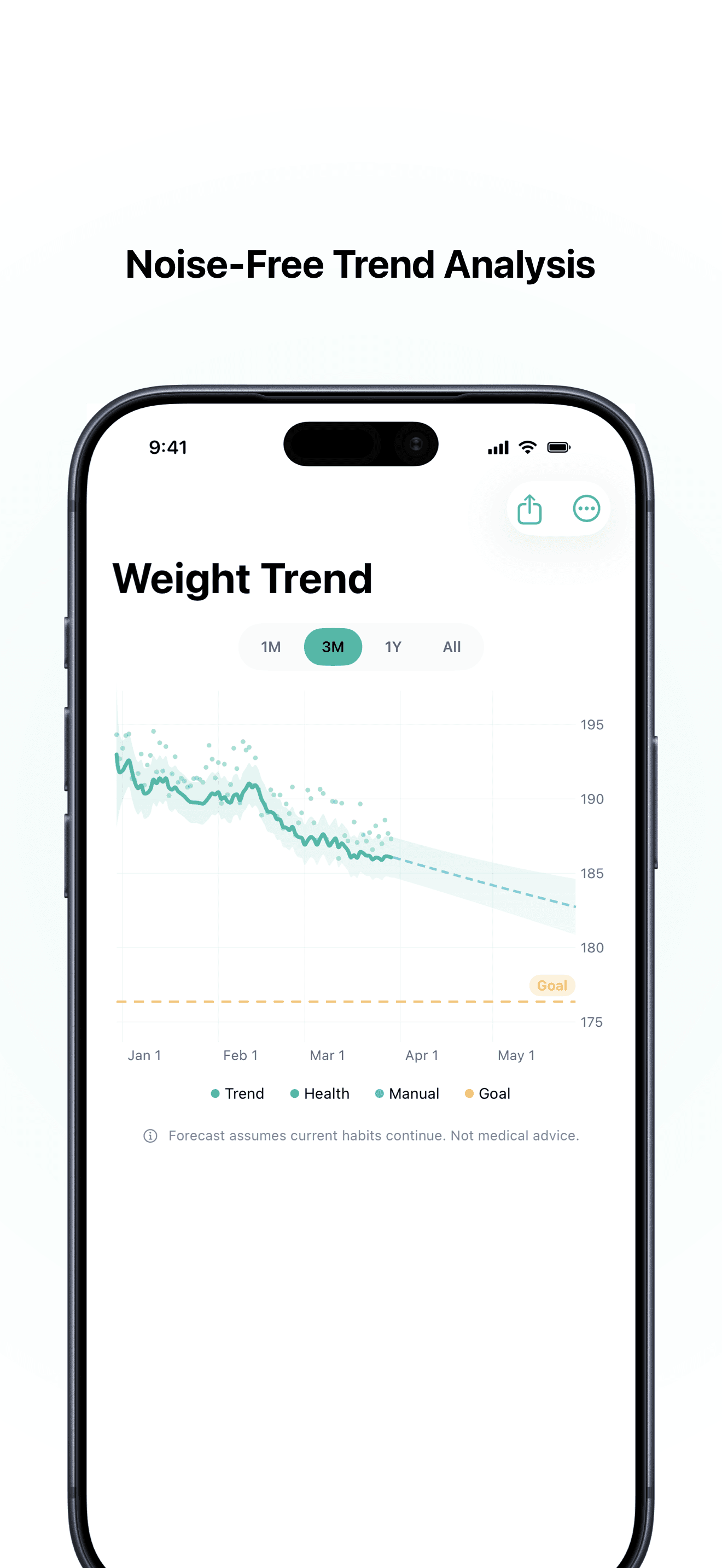
The anatomy of the chart
| Element | What it is | What it's for |
|---|---|---|
| Dots | Your raw weigh-ins, exactly as recorded | Evidence. Each one is a noisy sample, not a verdict |
| Line | The estimated trend — where your weight actually sits once noise is removed | The number that means something |
| Shaded band | Uncertainty around the estimate | How much to trust the line right now |
| Dashed extension | A forecast, if current habits continue | A projection, not a promise |
| Horizontal line | Your goal weight | Reference only — it has no effect on the maths |
The most important thing about this picture is the relationship between the dots and the line. The dots scatter above and below the line, roughly evenly. That's the signature of noise behaving normally. The line doesn't chase them, and it isn't supposed to.
The dots are not your weight
Every weigh-in is your underlying weight plus an error term. That error is typically 0.5–2 kg (1–4 lb) and comes from the contents of your gut, hydration, sodium, glycogen, and — for anyone who menstruates — hormonal fluid shifts. Why your weight fluctuates every day covers the mechanisms.
Here is the problem this creates, in one comparison. A solid, sustainable rate of fat loss is about 0.5 kg (1 lb) per week — roughly 70 grams a day. The daily noise is 0.5–2 kg. The noise is ten to thirty times larger than the signal you're trying to detect.
That ratio is why reading individual numbers doesn't work, and why no amount of discipline or willpower makes you better at it. You are being asked to spot a 70-gram change inside a 1,500-gram cloud. It's not a character flaw; it's an impossible measurement task.
What the line is doing
The trend line is an estimate of where your weight sits after the noise is averaged away. Different apps compute it differently — a simple moving average, an exponentially weighted average, or a filter that also models how fast your weight is moving. TrendBody uses the last kind; the engineering write-up has the details.
What matters for reading the chart is what they all share: the line is a statement about the past few weeks, not about today.
Why the line lags — and why that's correct
New users often notice that after a good week the line sits above the dots, and after a bad week it sits below them, and conclude the chart is slow or broken.
It isn't. Every method for removing noise works by pooling information across time, and pooling across time means the estimate reflects a window that includes the past. Lag is the price of noise rejection, and it's a genuine trade-off, not an implementation flaw. A line that responded instantly to your latest reading would be a line that reproduced every water swing — in other words, the raw dots again, and no use to anyone.
So when the line sits above your morning reading, that isn't the chart being pessimistic. It's the chart saying: one low reading isn't enough evidence yet. If the next several readings agree, the line comes down to meet them. If they don't, you were looking at a fluctuation and the line was right to hold.
The practical consequence: the line is most trustworthy in the middle of your data and least trustworthy at the right-hand edge, where it has the least future information to work with. Judge your progress from the shape of the last month, not the last point.
Reading your rate off the chart
The single most useful number on a trend chart is not the level — it's the slope.
To read it, pick two points on the line (never the dots) about four weeks apart and take the difference:
- Line four weeks ago: 84.0 kg
- Line today: 82.6 kg
- Change: −1.4 kg over 4 weeks = −0.35 kg/week
That figure is what your body is actually doing. It's also directly interpretable as energy balance: roughly 0.35 kg of tissue a week corresponds to a deficit of a few hundred calories a day, which is why a trend line can estimate your energy balance without any food logging.
Use four weeks rather than one. Over a single week the slope is dominated by wherever the noise happened to leave the endpoints.
How wide the band is, and what that tells you
The shaded band is the chart's honesty mechanism: it shows how confident the estimate is, and that confidence varies.
The band gets wider when you weigh irregularly (fewer samples), when your readings are scattered more than usual (a salty week, a new training block, illness), or right after a gap in your data. It gets narrower when you weigh consistently and your readings agree with each other.
The practical rule: if the band is wide enough that a flat line and a falling line would both fit inside it, the chart cannot yet tell you which is happening. Wait, and keep weighing. A chart with no band at all isn't more confident — it's just less honest about what it doesn't know.
Telling a real turn from noise
This is the question people actually bring to the chart: has something changed, or is this just a bad fortnight?
Time is the discriminator, and the arithmetic above tells you how much. If your true rate is 0.5 kg/week and daily noise is around 1 kg:
- After 1 week, real change is ~0.5 kg — smaller than a single day's noise. Unreadable.
- After 2 weeks, ~1 kg — comparable to the noise. Suggestive, not conclusive.
- After 3–4 weeks, 1.5–2 kg — clearly larger than the noise. Now the chart can speak.
Hence the rule that runs through all of these guides: three to four weeks before you conclude anything. A stall shorter than that carries almost no information, which is exactly why most "plateaus" resolve on their own — see how long a weight-loss plateau lasts.
Two supporting signals help. First, direction of the band, not just the line: a genuine change of pace usually shows as the trend leaving its previous band, not merely wobbling inside it. Second, the dots' behaviour: if they're still scattered evenly around the line, nothing has changed structurally — you're seeing normal noise around a new level.
Zoom changes the story — deliberately choose it
The same data looks like a different life at different time ranges, and this is the most common self-inflicted misreading.
- 1 month — mostly noise. Useful for checking your weigh-in consistency; nearly useless for judging progress.
- 3 months — the honest default. Long enough for the slope to be real, short enough to reflect what you're doing now.
- 1 year / All — the strategic view. This is where plateaus, regain, and maintenance stretches become visible as what they are.
If you find yourself opening the 1-month view several times a day, you're not gathering information — the underlying weight hasn't meaningfully moved since you last looked. Set the chart to 3 months and check it weekly.
The forecast is a projection, not a prediction
The dashed extension answers a narrow, conditional question: if the current rate continued unchanged, when would I reach my goal?
That condition does a lot of work. Rates don't continue unchanged — energy expenditure falls as you get smaller, adherence varies, and life happens. This is why an honest forecast is drawn as a widening cone rather than a line: uncertainty compounds the further out you look. A forecast that gives you a single confident date months away is telling you something it cannot know. Treat the near end as informative and the far end as a rough scenario. The 3,500-calorie rule is the classic example of what goes wrong when a projection is mistaken for a prediction.
A weekly reading routine
- Weigh daily, at a consistent time — morning, after the bathroom, before eating or drinking. Daily weighing isn't about caring more about the number; it's about giving the filter enough samples to cancel the noise.
- Log the number and move on. A single reading is one noisy sample. It is not feedback on yesterday.
- Look at the chart once a week, on the 3-month range.
- Read the slope, not the level. Four-week difference on the line.
- Only act on 3–4 weeks of consistent evidence — and when you do, adjust behaviour rather than reacting to the number.
Missing a day is fine. Missing a week widens the band. Weighing five times on a bad day tells you nothing except which of those five readings you preferred.
What the chart won't tell you
Be clear about the limits, because they matter:
- It can't separate fat from lean mass or water. A flat trend during a new strength programme can hide real fat loss under added muscle glycogen and repair fluid — see why the scale goes up after a workout.
- It can't tell you why. The chart is a measurement instrument, not a diagnosis.
- It isn't a health verdict. Weight is one signal among many, and this is general information rather than medical advice. Persistent unexplained weight change in either direction is worth raising with a clinician.
If daily weighing or trend-watching increases anxiety rather than reducing it, less frequent weighing — or none — is a legitimate choice. Some people are better served by an interface that shows only direction, not numbers.
The point of all this
A trend chart is not a nicer-looking scale. It's a different measuring instrument, one that answers the question you actually had. The scale measures mass; you wanted to know about fat, and about direction. The chart converts one into the other by spending time as currency — accepting a few weeks of lag in exchange for an answer that's true.
Read the line, not the dots. Read the slope, not the level. Give it a month. That's the whole skill.
Sources
- Vuorinen AL, Helander E, Pietilä J, Korhonen I. Frequency of self-weighing and weight change: cohort study with 10,000 smart scale users. Journal of Medical Internet Research, 2021. PubMed
- Helander EE, Vuorinen AL, Wansink B, Korhonen IK. Are breaks in daily self-weighing associated with weight gain? PLOS ONE, 2014. PubMed
- Zheng Y, et al. Self-weighing in weight management: a systematic literature review. Obesity, 2015. PubMed
- Standard signal-processing results on the trade-off between smoothing and estimator lag.